New Wentworth Shire Council Branding
Introducing the new Wentworth Shire Council Branding.
Our main objectives:
- To improve communication with the local community.
- To create a brand that’s inclusive, transparent, progressive and friendly.
- To strengthen and build awareness of the Wentworth Shire Council outside the region.
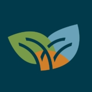
- The organic leaf shapes have been designed to symbolise growth and the unique landscapes in and around the Wentworth Shire.
- The brand colouring was chosen to reflect the natural environment including land, water, flora and the open blue skies.
- The “W” icon is inspired by the Junction of the Murray and Darling rivers, connecting the three shapes, which also represent movement, irrigation, and progress.
- Another key design consideration was associating the council branding with the tourism branding. This was achieved by incorporating the “W” icon into both identities, combining the overall brand colour palette, and sharing the same typefaces.

